
How to Use Gantt Charts in WordPress
There are multiple ways to view your project’s progress in WordPress, including several different types of lists and charts.
One of the most popular project displays is a Gantt chart.
A Gantt chart is a great option for getting a high-level overview of a project. It provides you with a clear picture of the lengths of activities and when they overlap. Gantt charts are useful in many project management approaches, including the WBS system for projects.
This image below shows a Gantt chart created with the Project Timeline extension for WordPress. On the left of the chart is a list of the activities and along the top is a time scale. Each milestone and task has the start date, the end date, and the completion percentage.
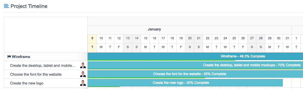
You can see four project items on this chart:
- Wireframe … overall goal
- Create the desktop, tablet and mobile mockups … individual task
- Choose the font for the website … individual task
- Create the new logo … individual task
Looking at the image, you can easily see how the three tasks relate to each other in terms of time:
- The new logo needs to be finished first, but is only 20% done.
- The mockups don’t need to be finished for some time, but they are already 70% done.
Historical Background
You might have guessed that “Gantt” is the name of the person who invented these charts.
Almost.
An early version of the cart was in use in Europe, but the man who popularized its use was Henry Gantt who lived in New Jersey in the early 1900s. He worked in an iron foundry and designed his charts so that supervisors could easily know whether production was on schedule, or behind schedule.
Gantt charts really exploded in popularity during World War One, under William Crozier of the U.S. army. The army was ordering larger and larger quantities of weapons, but found it was difficult to understand what progress was being made in the filling of these orders. The main advantage of the Gantt chart is that it doesn’t remain static over time – it adapts to changes in project progress. Crozier found the Gantt chart to be incredible effective, and by the end of the war it was being used throughout the army.
Sample Gantt Charts
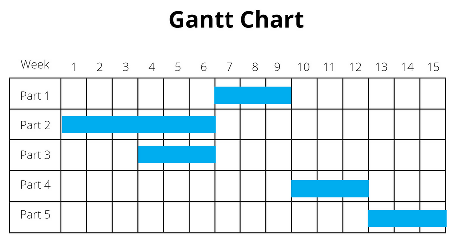
A Gantt chart can come in many different forms. Sometimes they are very simple with few moving details, and little extra information. This next image shows a very simple Gantt chart:
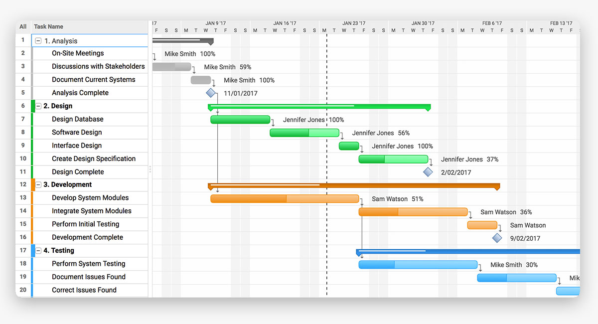
This next chart is slightly more complex. It also contains 5 milestones, with individual tasks underneath:

Some Gantt charts include an feature called dependencies that we haven’t mentioned yet. Notice the arrows that connect each horizontal bar? That shows how that those two tasks are dependent on each other. The first task must finish before the next starts.
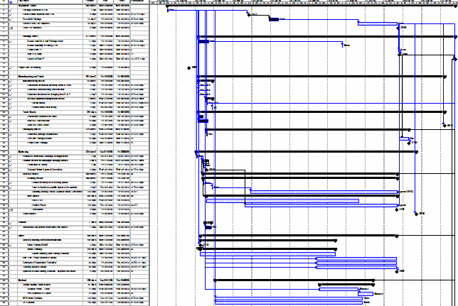
A particularly busy Gantt chart can end up with many, many moving pieces. In the image below, notice the spreadsheet-like columns on the left … this chart is carrying lots and lots of extra data, beyond the basic Gantt elements that we’ve seen earlier.
Here’s how to use the Gantt Chart feature in UpStream:
Conclusion
If you’re looking to manage projects on your WordPress site, check out the UpStream plugin. The Project Timeline extension enables you to use Gantt charts on your WordPress projects.