
UpStream 1.26 Has Big Gantt Chart Improvements
UpStream 1.25 was released last week, but we’re already moving forward again.
UpStream 1.26 is here and it brings big improvements to the Project Timeline / Gantt Chart feature in UpStream.
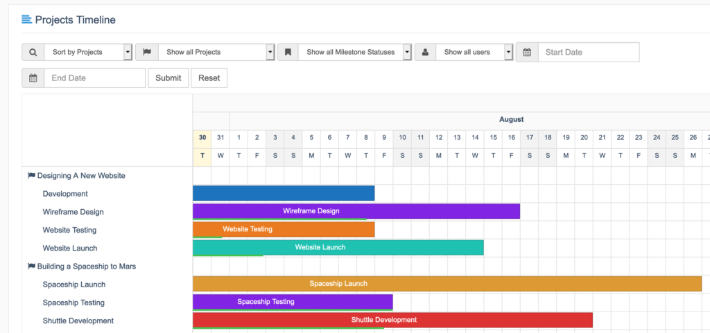
New Project Timeline page
When you update, there will be a new “Timeline” link on the frontend of your projects:
This “Timeline” link leads to a big new version of the Project Timeline extension. This is the Gantt Chart for UpStream. This chart gives you an overview of all the Milestones across all your projects.
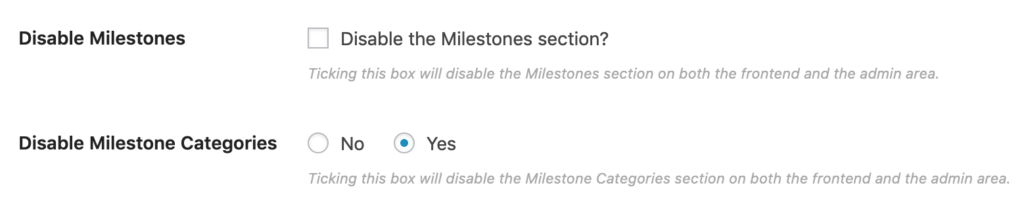
Milestone Categories
For large sites, there’s now the option to categorize your Milestones.
Beyond the ability to organize and filter your Milestones, the main benefit is the color on the frontend. If you choose a color for Milestone Category, it will cascade down to all the Milestones in that category. This will work unless you’ve also picked a color for a single Milestone.
You can disable this feature by going to UpStream > Settings > Disable Milestone Categories:
See all your projects on the frontend
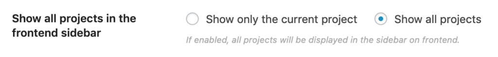
We added an option to show all your projects in the left sidebar on the frontend:
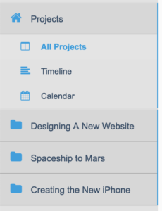
You can enable or disable this feature by going to UpStream > Settings > Show all projects in the frontend sidebar
More notifications
We are working on improved notifications for UpStream. In the short term, there is a change to notifications: new comments/discussions will send an email to everyone in a project.
Other updates
To make these changes possible, there were releases for three UpStream extensions:
- Project Timeline, version 1.3.0. See the changelog.
- Copy Project, version 1.1.4. See the changelog.
- Frontend Edit, version 1.10.0. See the changelog.